Toward the end of August, we’re launching a new UUCB website and an updated logo. It’s been a big project through the spring and summer, and with a change like this, it’s always fair to ask: why?
When the Communication Team first met last fall along with our membership coordinator Irene, we talked a lot about what the purpose of the website was – who it was for and what it needed to do. We did research into what other congregations are doing, and what some of the standards and expectations of church websites are today.
What quickly became clear was that our website needed to be a front door for newcomers. Nearly every single person who walks into the building has stopped first at the website to get a feel for who we are and what we’re about. A great many of them have gone from the website to our YouTube Channel to watch a service live to browse our library of recordings. (Incidentally, if you haven’t yet browsed through the YouTube Channel and subscribed, you can check it out at this link.)
To make the website effective for people exploring UUCB, the site needs to tell the story of who we are, what we’re about, and how we do it. And it needs to tell the story through text, photos, and video that are easy to understand even if you don’t know anything about Unitarian Universalism. Secondarily, the site needs to make it easy to get involved with the 30+ small groups at UUCB, and to provide an easy, appealing calendar of events to which the whole church community is invited. Our site as it is just doesn’t do these key tasks very well.
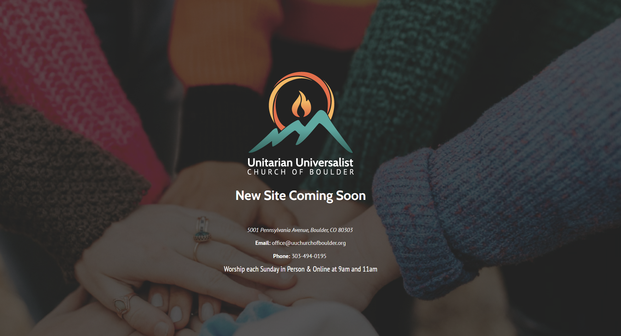
At the same time, we worked on a new iteration of our logo. Our current logo has been lovely and done good, hard work for us this last decade, and it’s showing its age – it doesn’t look contemporary, and its cool-tone, single-color, flat design doesn’t reflect the earthy vibrancy and interconnecting parts of our congregation. We asked our designer Emily Starks to develop a logo that spoke to those interconnected pieces of our community joined together, and which maintained the focus on the flaming chalice symbol and on the Front Range, and would coordinate with a color palette that we could use throughout the site and printed signage.
A key concern during the design process was for the look and feel to meet current standards, but especially for it to reflect us. (If, for example, the website was perfectly engineered to be monotone and minimalist… well, that sort of perfectionism is just not UUCB!) We feel glad to have worked with Emily Starks as our designer – she knows our community well and worked to capture some of that intangible feel of who we are.
On Sunday August 20th our new site and new logo will launch! (That’s also the first Sunday of our “regular” church year with two services at 9:00 and 11:00.) We hope to see you then for the grand opening!
With excitement,
Your Communications Team
Steve Todd, Chris Zanoni, Sam Henderson, and Rev. David